January 2, 2014 by miriam fishman
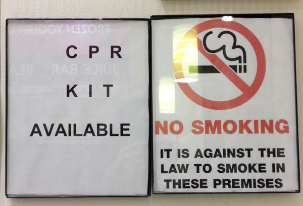
The wacky kerning and misalignment of letters reads more like an eye chart than signage.