

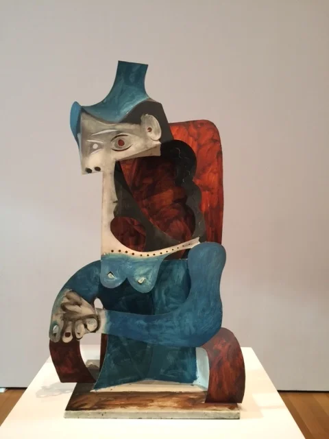
What an extraordinary mark she left.
What an extraordinary mark she left.

Very engaging interactive piece that amplifies the effects of sound, and the lack thereof, on our experiences. Get your earbuds and give a listen—Dear Architects: Sound Matters

Hard to believe that one artist produced so much impactful and engaging work! The show is stunning.
Gotta love this cover!
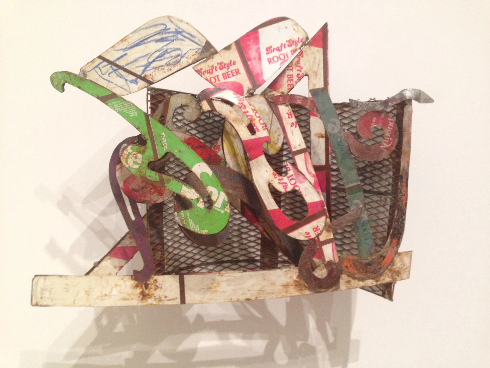
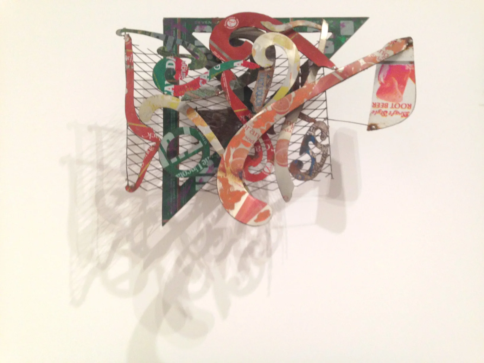
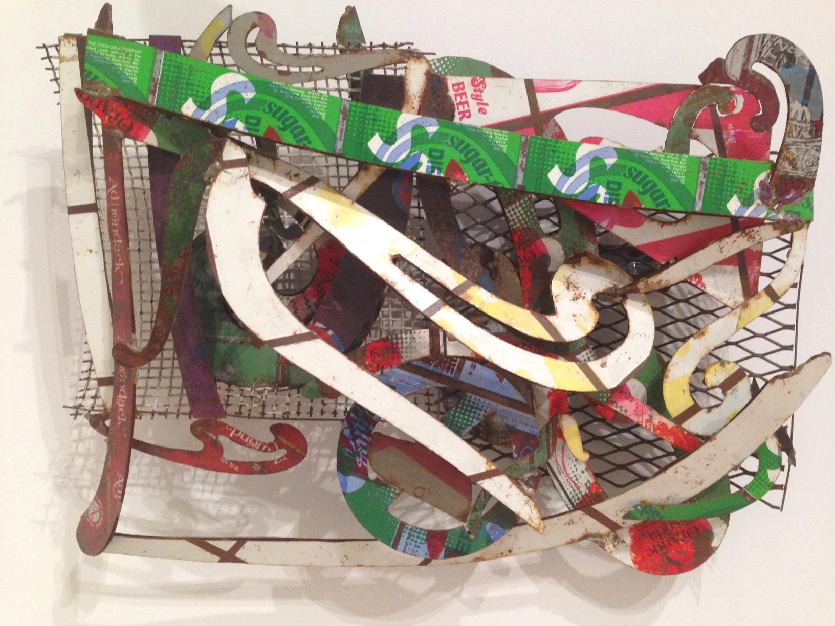
These are small maquettes (scale models) for the huge wall reliefs that Frank Stella made while in India. They utilize recycled tin cans that have lively "given" color and typographic markings. They seem to work better, in many ways, at this scale (14" high) than the larger pieces fabricated later that were based upon them.
Currently at the Whitney Museum.


A giant field of steel.

With babies in waiting...


Down the block from Ben Franklin's home of invention...where lots happened.
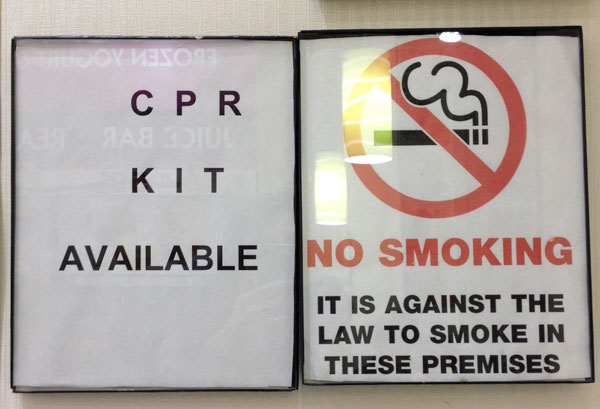
The wacky kerning and misalignment of letters reads more like an eye chart than signage.
This is a photo of of an original architectural drawing that details the tile pattern of a letter "L" for the NYC subway.

The mosaic typography in the NYC subways blows me away. It is especially beautiful up close-up, and to imagine these Italian immigrant tilers cutting and laying these up on a table in a loft in the early 1900's. Then the assembled mosaic panels must've been transported to the many IRT stations to be set in place on top of an eye-level course of white "subway" tiles.

Click or paste this url into your browser to see a cool short film about our hood on the nytimes site:
http://www.nytimes.com/video/fashion/100000002546840/intersection-urban-classics-in-new-york-city-union-square.html?emc=eta1

One of the beautiful architectural details at The Old American Can Factory in Gowanus Bklyn.


